
CLIENT
YEAR
Avtocenter BTG d.o.o.
2026
One group. Two showrooms. Three stories.
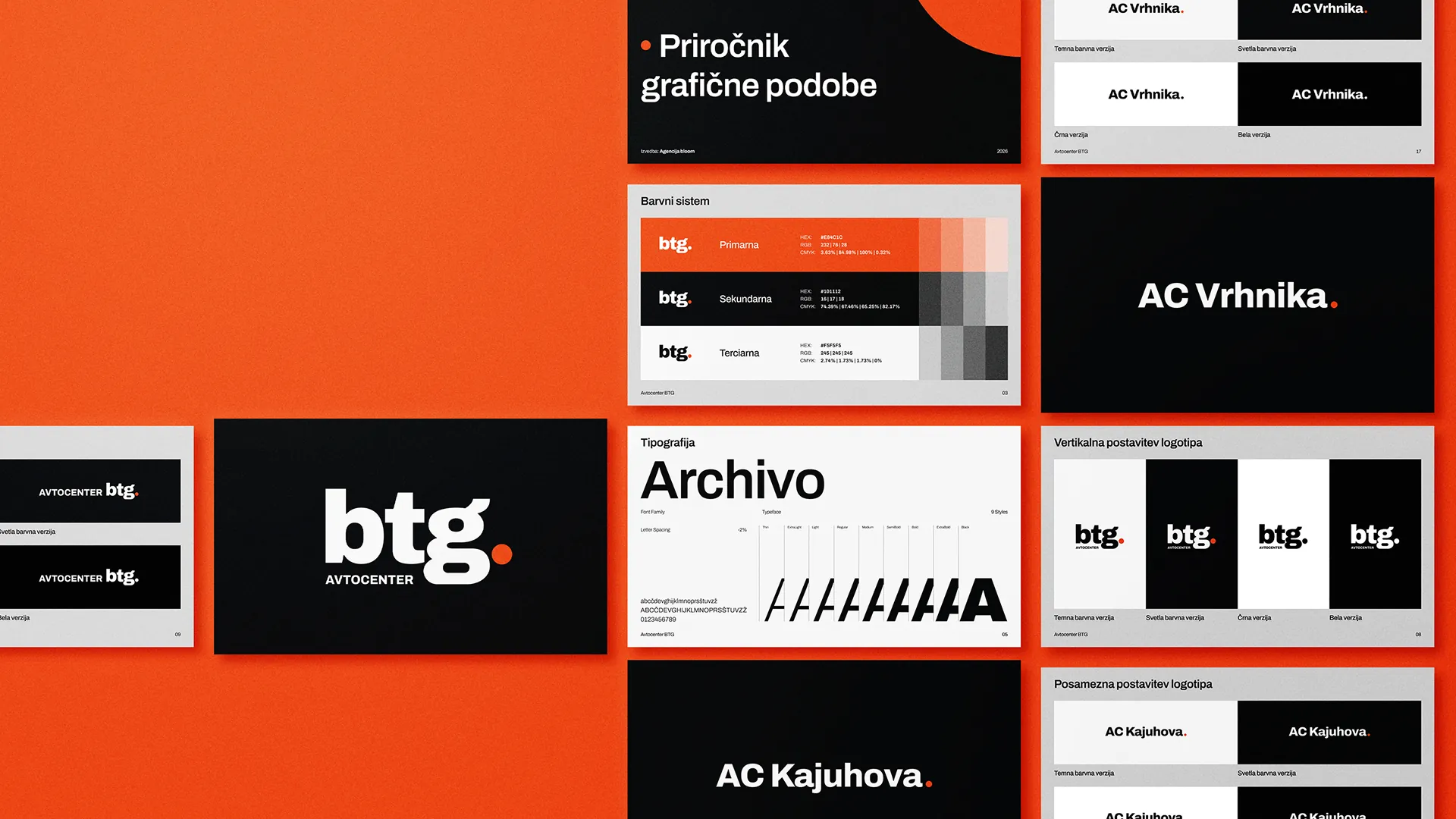
For Avtocenter BTG, we redesigned the logo and visual identity. The BTG parent brand got a fresh, modern face, while the AC Kajuhova and AC Vrhnika showrooms each got their own logo, aligned with the parent brand but with a character of their own.
CLIENT
Avtocenter BTG d.o.o.
PROJECT
Avtocenter BTG
SERVICES
Parent logo redesign
AC Kajuhova showroom logo
AC Vrhnika showroom logo
Typography
Color palette
Brand guidelines
Business cards
Avtocenter BTG is an automotive group with two showrooms, each with its own represented brands and its own customers. The existing visual identity could no longer convey that structure: at a glance, it wasn’t clear what was the group, what was a showroom, and how it all fit together.
So the task was twofold. First, bring order: BTG as the parent brand, with AC Kajuhova and AC Vrhnika as sub-brands beneath it. Then build the look: a redesigned group logo and two new showroom logos, visually aligned with the parent brand yet each with its own character. Customers need to recognize their showroom at first glance while also seeing the bigger whole behind it.
The BTG parent logo.
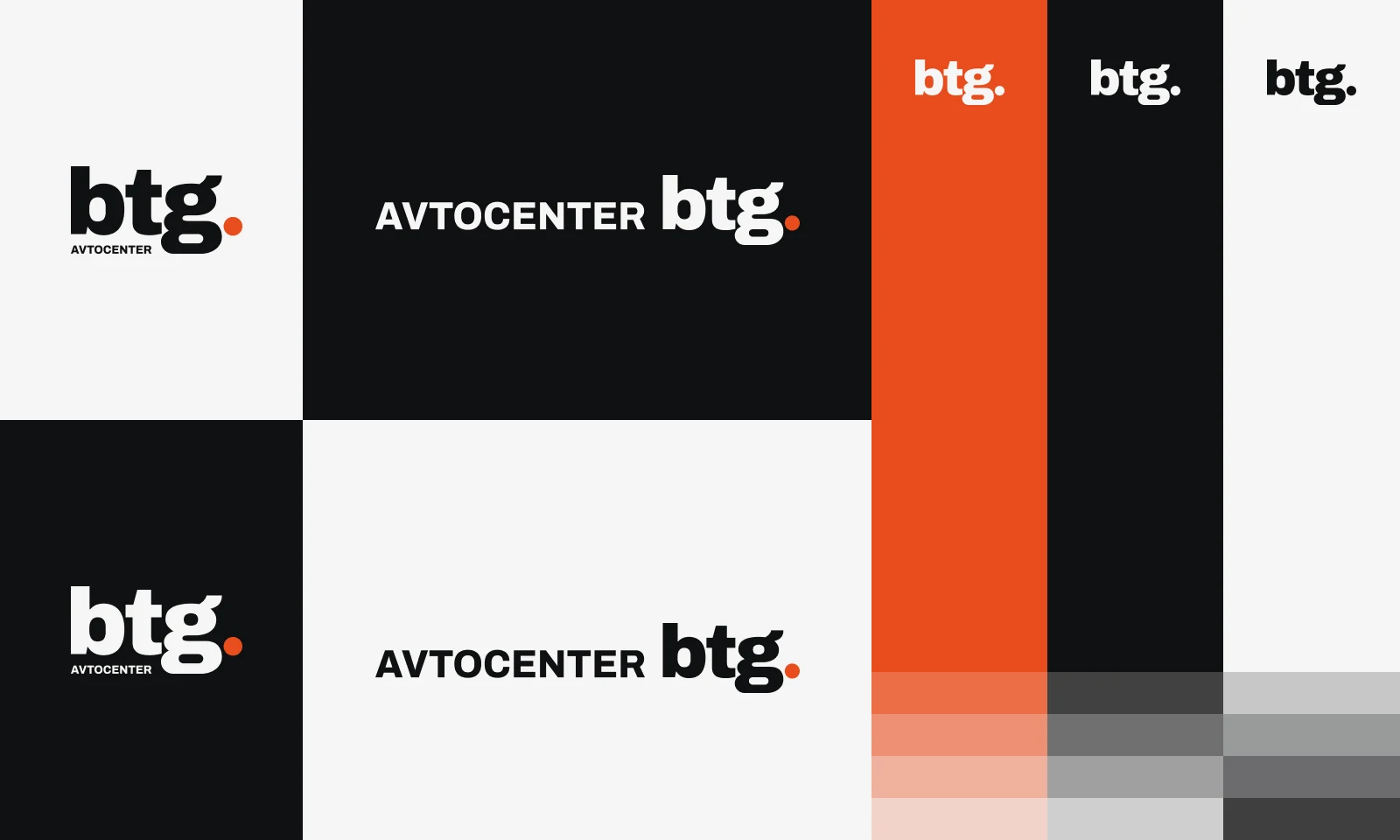
We started at the top: reviewing the existing identity, setting the starting points and redesigning the Avtocenter BTG logo. The new look is modern and calm, because it has to carry everything beneath it: the showrooms, the service center and the sales lineup.
Showroom logos.
From the parent brand, we developed logos for AC Kajuhova and AC Vrhnika. Each has its own character, yet both speak the same language: the same compositional logic, the same handwriting. Every logo comes in all the versions real-world use demands: for light and dark backgrounds, single-color, horizontal and vertical.
Colors and typography.
We defined color palettes for BTG and both showrooms, plus a shared typography. Colors set the showrooms apart, typography ties them together, so the new identity works as a family, not three random brands.
Brand guidelines and first applications.
We captured all the rules in a brand guidelines document with instructions for the correct use of logos, colors and typography across all three brands. We also designed business cards and delivered all files in vector format (AI, PDF, PNG, SVG). Whatever gets created tomorrow will look like it belongs to BTG.
Today, Avtocenter BTG has a clear brand architecture and a refreshed visual identity that works on any material, from business cards to building facades. The new look is also the foundation for the next steps we’re taking together: a new website and digital advertising. Read more about our approach on the Brand development page, and see a related story in our RAAC rebranding case study.
Does your brand no longer
reflect who you are?
Tell us where you are today and where you want to go. On an intro call, we map out the path together, no strings attached.